Clustering
Nov 25, 2020 21:13 · 1847 words · 9 minute read
library(dplyr)
##
## 다음의 패키지를 부착합니다: 'dplyr'
## The following objects are masked from 'package:stats':
##
##     filter, lag
## The following objects are masked from 'package:base':
##
##     intersect, setdiff, setequal, union
crime <- read.csv('TableB10.csv')
options(warn=-1) # turning back code: warn=0
# Preprocessing
crime <- crime %>%
  mutate(pop = round(POPU1985 / LANDAREA,3)) %>%
  select(-c(POPU1985,LANDAREA))
cat.data <- select(crime, c(REG,DIV))
crime <- select(crime, -c(REG,DIV))
crime <- scale(crime)
head(crime)
##            MURD       RAPE         ROB       ASSA       BURG       LARC
## [1,] -1.3924177 -1.1725318 -0.97496111 -1.0770184 -1.0214658 -1.2519066
## [2,] -1.2624795 -1.3086195 -0.98044396 -1.4584196 -1.0103870 -1.4294141
## [3,] -1.4443930 -0.7234423 -1.02978965 -1.1797033 -0.5533863 -1.3730625
## [4,] -0.8726649 -0.4920932 -0.02204107 -0.6956171  0.5628033 -0.5813229
## [5,] -0.9506278 -1.6352301 -0.25451409 -0.2262003  0.2442876  0.3414342
## [6,] -0.8726649 -0.8867476 -0.34114318 -0.7102864  0.4243182 -0.2713892
##            AUTO        pop
## [1,] -1.1114700 -0.5565443
## [2,] -0.9812157 -0.2106586
## [3,] -1.2216852 -0.4570429
## [4,]  2.5556898  2.6085466
## [5,]  2.4605039  3.0634100
## [6,]  0.5818360  2.2768754
Data description
현재 다루고 있는 데이터는 다음과 같이 나타난다.
| 변수명 | 데이터 타입 | 변수 설명 |
|---|---|---|
| POP | NUM | 인구/면적으로 생성한 파생변수로 인구밀도를 나타낸다. |
| MURD | NUM | 10만명당 살인건수 |
| RAPE | NUM | 10만명당 강간건수 |
| ROB | NUM | 10만명당 강도건수(현장에 피해자 존재), 강도1 |
| ASSA | NUM | 10만명당 폭행건수 |
| BURG | NUM | 10만명당 강도건수(현장에 피해자 존재X), 강도2 |
| LARC | NUM | 10만명당 절도건수 |
| AUTO | NUM | 10만명당 자동차 절도건수 |
| REG | CAT | 1~4, 지역구분(West, midwest, south, and northeast) |
| DIV | CAT | 1~9, REG에서 더 세부적으로 나뉨 |
Factor Analysis
요인 분석은 잠재변수를 찾아서 차원을 축소하는 방식이다. 현재 데이터는 범주형 변수를 제외하고 8개의 변수(인구밀도 및 범죄유형)가 존재한다. 요인분석은 해당 8개의 변수를 더 적은 수의 변수로 설명하는 것이다. 이 때 몇개의 요인으로 이 변수를 설명하는 것이 적절한지에 대한 문제가 있는데, 해당 문제는 흔히 두가지 방식으로 결정할 수 있다.
현재 데이터의 경우 Factor Analysis에서 적절한 factor 개수를 결정하기 위해 다음의 두가지 플랏을 그렸다. 좌측은 Scree plot이고 우측은 Parallel Analysis를 이용한 방식이다. Scree plot을 그렸을 때 고유값이 1보다 클 때에는 요인이 3개일 때이다. 또한 우측의 그래프에서 교차하는 지점의 이전에서 가장 큰 정수는 3이다.
Horn’s’ parallel anlalysis를 이용하여 FA에서의 요인 갯수를 산출한다. 해당 방법은 데이터 매트릭스에서 생성된 고유값과 몬테카를로 시뮬레이션으로 만들어진 고유값을 비교한다. 따라서 요인의 개수를 3으로 설정하는 것이 합리적이라고 볼 수 있다.
(Horn, J.L. A rationale and test for the number of factors in factor analysis. Psychometrika 30, 179–185 (1965). https://doi.org/10.1007/BF02289447
library(psych)
covm <- cov(crime)
corr <- cov2cor(covm)
par(mfrow=c(1,2))
scree(corr, factor=F)
fa.parallel(corr, fa='fa')
## Parallel analysis suggests that the number of factors = 3 and the number of components = NA요인의 개수를 3개로 결정하였다. 그렇다면 해당 3개의 요인은 각각 어떤 변수를 설명하고 있을까? 어느 변수를 얼마만큼의 설명력으로 나타내고 있는지는 다음과 같다.
fa.varimax <- fa(crime, nfactors=3, rotate='varimax')
colnames(fa.varimax$loadings) <- paste('Factor',1:3,sep='')
colnames(fa.varimax$scores) <- paste('Factor',1:3,sep='')
fa.df <- fa.varimax$scores
par(mfrow=c(1,1))
fa.varimax
## Factor Analysis using method =  minres
## Call: fa(r = crime, nfactors = 3, rotate = "varimax")
## Standardized loadings (pattern matrix) based upon correlation matrix
##      Factor1 Factor2 Factor3   h2    u2 com
## MURD    0.04    0.87   -0.04 0.76 0.245 1.0
## RAPE    0.65    0.57   -0.08 0.75 0.253 2.0
## ROB     0.50    0.41    0.38 0.56 0.439 2.8
## ASSA    0.29    0.92    0.08 0.94 0.061 1.2
## BURG    0.85    0.28    0.23 0.86 0.141 1.4
## LARC    0.91    0.04   -0.02 0.83 0.174 1.0
## AUTO    0.62    0.12    0.64 0.81 0.193 2.1
## pop    -0.01   -0.07    0.98 0.96 0.036 1.0
##
##                       Factor1 Factor2 Factor3
## SS loadings              2.69    2.19    1.57
## Proportion Var           0.34    0.27    0.20
## Cumulative Var           0.34    0.61    0.81
## Proportion Explained     0.42    0.34    0.24
## Cumulative Proportion    0.42    0.76    1.00
##
## Mean item complexity =  1.6
## Test of the hypothesis that 3 factors are sufficient.
##
## The degrees of freedom for the null model are  28  and the objective function was  6.25 with Chi Square of  284.16
## The degrees of freedom for the model are 7  and the objective function was  0.11
##
## The root mean square of the residuals (RMSR) is  0.01
## The df corrected root mean square of the residuals is  0.03
##
## The harmonic number of observations is  50 with the empirical chi square  0.45  with prob <  1
## The total number of observations was  50  with Likelihood Chi Square =  4.94  with prob <  0.67
##
## Tucker Lewis Index of factoring reliability =  1.034
## RMSEA index =  0  and the 90 % confidence intervals are  0 0.14
## BIC =  -22.45
## Fit based upon off diagonal values = 1
## Measures of factor score adequacy
##                                                   Factor1 Factor2 Factor3
## Correlation of (regression) scores with factors      0.96    0.97    0.98
## Multiple R square of scores with factors             0.92    0.94    0.97
## Minimum correlation of possible factor scores        0.84    0.88    0.93
fa.diagram(fa.varimax)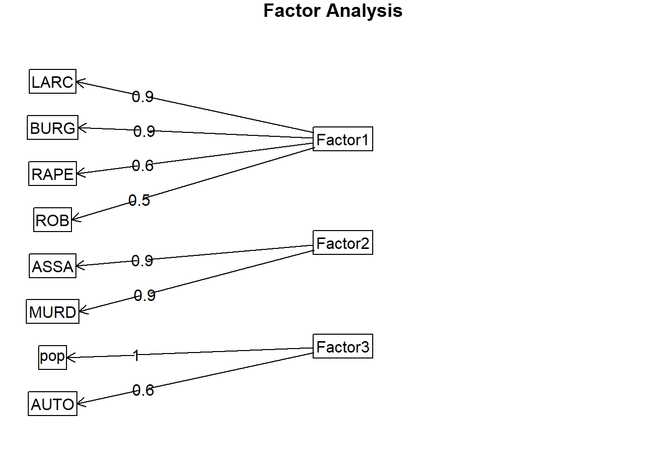
3가지의 요인은 데이터 매트릭스의 약 81%를 설명하고 있다.
Factor1은 절도, 강도1, 강간, 강도2를 설명한다. Factor2는 폭행과 살인을 설명하고 factor3은 인구밀도와 자동차 절도를 설명한다. 잠재변수의 관점으로 라벨링을 하면 factor1은 대인/대물범죄 factor2는 대인범죄 factor3은 인구밀도에 따른 차량절도죄를 설명한다. 계수를 살펴보면 다음과 같다.
\[ F_{1} = 0.04MURD + 0.65RAPE + 0.50ROB + 0.29ASSA + 0.85BURG + 0.91LARC + 0.62AUTO - 0.01 pop \]
\[ F_{2} = 0.87MURD + 0.57RAPE + 0.41ROB + 0.92ASSA + 0.28BURG + 0.04LARC + 0.12AUTO - 0.07 pop \]
\[ F_{3} = - 0.04MURD - 0.08RAPE + 0.38ROB + 0.08ASSA + 0.23BURG - 0.02LARC + 0.64AUTO + 0.98 pop \]
이 때 factor1(대인/대물범죄)은 절도, 강도1, 강간, 강도2와 양의 관계에 있으며 factor2(대인범죄)는 폭행과 살인에 대해 양의 관계를 가진다. factor3은 인구밀도와 차량절도죄에 대해 양의 관계를 가지고 있다.
군집분석
Unsupervised Learning-Clustering 포스팅에 언급을 하였지만, 크게 계층적 군집분석과 비계층적 군집분석을 나눌 수 있다. 계층적 군집분석은 Single, Complete, Average, Centroid, Ward method (거리 계산하는 방식이 각각 다르다.)의 방식이 있다. Distance matrix를 이용하여 계층을 나누는 것인데 실제 계층적 군집분석을 진행할 때, 지역이 차이가 있는지 확인해보자.
library(dendextend)
##
## ---------------------
## Welcome to dendextend version 1.14.0
## Type citation('dendextend') for how to cite the package.
##
## Type browseVignettes(package = 'dendextend') for the package vignette.
## The github page is: https://github.com/talgalili/dendextend/
##
## Suggestions and bug-reports can be submitted at: https://github.com/talgalili/dendextend/issues
## Or contact: <tal.galili@gmail.com>
##
##  To suppress this message use:  suppressPackageStartupMessages(library(dendextend))
## ---------------------
##
## 다음의 패키지를 부착합니다: 'dendextend'
## The following object is masked from 'package:stats':
##
##     cutree
dend <- crime %>% dist %>% hclust(method='average') %>% as.dendrogram(labels=cata.data$REG)
dend.hc <- crime %>% dist %>% hclust(method='average')

i=0
colLab<<-function(n){
  if(is.leaf(n)){
    #I take the current attributes
    a=attributes(n)
    #I deduce the line in the original data, and so the treatment and the specie.
    ligne=match(attributes(n)$label,1:50)
    region=cat.data[ligne,1];
    if(region==1){cat.data$REG="red"};if(region==2){cat.data$REG="Darkgreen"}
    if(region==3){cat.data$REG="blue"};if(region==5){cat.data$REG="black"}
    #Modification of leaf attribute
    attr(n,"nodePar")<-c(a$nodePar,list(cex=1.5,lab.cex=1,pch=20,col=cat.data$REG,lab.col=cat.data$REG,lab.font=1,lab.cex=1))
  }
  return(n)
}

dL <- dendrapply(dend, colLab)
# ref: https://www.r-graph-gallery.com/31-custom-colors-in-dendrogram.html
plot(dL , main="Dendogram(average method)")
legend("topright",
       legend = c("reg=1" , "reg=2" , "reg=3" , "reg=4"),
       col = c("red", "Darkgreen" , "blue" , "black"),
       pch = c(20,20,20,20), bty = "n",  pt.cex = 1.5, cex = 0.8 ,
       text.col = "black", horiz = FALSE, inset = c(0, 0.1))

dend %>% rect.dendrogram(k=9)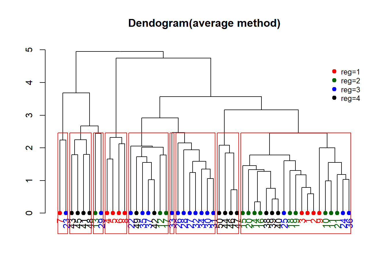
계층적 군집분석에서 distance matrix를 계산하는 방식에 대해 ward, complete, single, average, centroid가 있는데 지역을 기준으로 색을 칠할 때, 가장 분류가 잘 되는 군집분석은 average 형태였다.
실제 계층적 군집분석을 진행할 때 실제 분류된 군과 별개로 4개의 색을 이용해 미국의 각 지역을 표현하였다. 또한 4개로 나뉜 기준을 9개로 더 잘게 쪼갤 수 있는데, 실제 그래프에서 9개의 붉은 박스를 표현시 같은 색상으로 표현된 지역이라 하더라도 성질이 다른 경우가 있음을 찾아볼 수 있다. Dendogram에서 특히 눈에 띄는 것은, 2번째로 나눠진 것을 잘 살펴보면 reg=2와 reg=3 대부분이 특정 군에 묶인다는 것이다. 해당 지역을 기준으로 다시 하위군 분석을 진행해도 재밌을 것 같다.
library(ape)
##
## 다음의 패키지를 부착합니다: 'ape'
## The following objects are masked from 'package:dendextend':
##
##     ladderize, rotate
par(mfrow=c(1,2))
plot(as.phylo(dend.hc), type="unrooted", cex=0.8, main='unrooted')
plot(as.phylo(dend.hc), type="fan", cex=0.8, main='fan')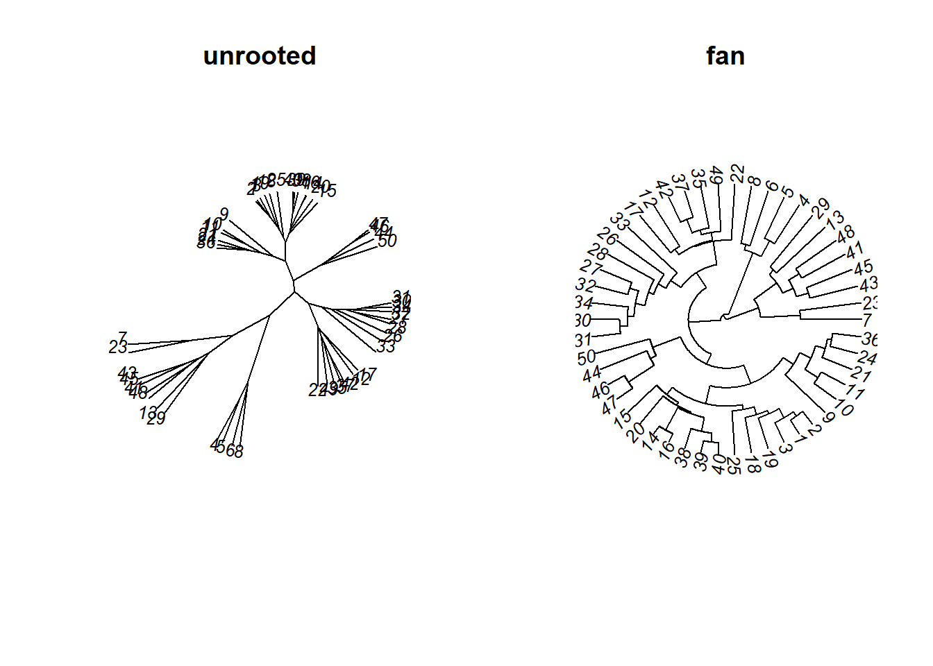
#ref: http://www.sthda.com/english/wiki/beautiful-dendrogram-visualizations-in-r-5-must-known-methods-unsupervised-machine-learning그 외 다양한 형태들의 dendogram을 나타낼 수 있다.
하지만 데이터에 라벨을 달고 해당 라벨에 따라 색상을 지정하고 싶으면, 위에서 나타난 것처럼 따로 함수를 짜야한다.
library(qgraph)
## Registered S3 methods overwritten by 'huge':
##   method    from
##   plot.sim  BDgraph
##   print.sim BDgraph
b5dist <- dist(fa.df, method="euclidean")
par(mfrow=c(1,2))
qgraph(b5dist, layout='spring')
qgraph(b5dist, layout='spring', labels=cat.data$REG) #서로 가까운 거리에 있으면 가깝게
이와 같은 그래프도 살펴볼 수 있다. 실제 유클리드 거리를 기준으로 가까운 포인트들을 묶은 것이고 오른쪽은 데이터의 인덱스가 아니라 지역의 라벨로 이를 표현한 것이다. 유클리드 거리를 기준으로는 거리가 가까운 것과 지역이 큰 관계가 없는 것으로 보인다.
k-means clustering
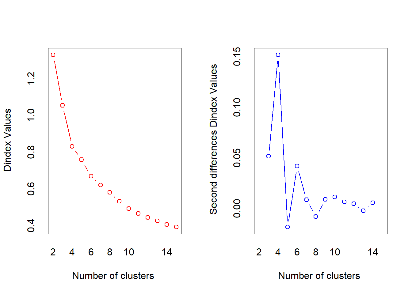
이제 계층적 군집분석이 아니라 fa를 통해 구한 3개의 요인에 대한 비계층적 군집분석을 진행하자. 가장 대표적인 방식으로 이용되는 k-means clustering을 활용할 것이다. EM-algorithm(Expectation-Maximization)의 아이디어로 k-means는 초기값으로 군의 평균을 랜덤하게 지정하고 해당 평균에 가까운 점을 같은 군으로 묶는다. 그리고 해당 과정을 계속 반복하는데, 반복횟수는 r에서 우리가 지정하지만 충분히 수렴하도록 적절한 값을 넣어줘야 한다. k-means에서는 군집의 개수 k를 몇으로 정해야 하는지가 이슈이다.
## k를 결정하는 방법
library(NbClust)
nc <- NbClust(fa.df, method = "kmeans")
## *** : The Hubert index is a graphical method of determining the number of clusters.
##                 In the plot of Hubert index, we seek a significant knee that corresponds to a
##                 significant increase of the value of the measure i.e the significant peak in Hubert
##                 index second differences plot.
## 
## *** : The D index is a graphical method of determining the number of clusters.
##                 In the plot of D index, we seek a significant knee (the significant peak in Dindex
##                 second differences plot) that corresponds to a significant increase of the value of
##                 the measure.
##
## *******************************************************************
## * Among all indices:
## * 4 proposed 2 as the best number of clusters
## * 5 proposed 3 as the best number of clusters
## * 8 proposed 4 as the best number of clusters
## * 1 proposed 6 as the best number of clusters
## * 1 proposed 9 as the best number of clusters
## * 3 proposed 11 as the best number of clusters
## * 1 proposed 14 as the best number of clusters
## * 1 proposed 15 as the best number of clusters
##
##                    ***** Conclusion *****
##
## * According to the majority rule, the best number of clusters is  4
##
##
## *******************************************************************
군을 4개로 설정하는 것이 가장 적절하다고 나타났다.
par(mfrow=c(1,1))
barplot(table(nc$Best.n[1,]), main="Number of Clusters Chosen",xlab='Number of Clusters',ylab='Number of Criteria')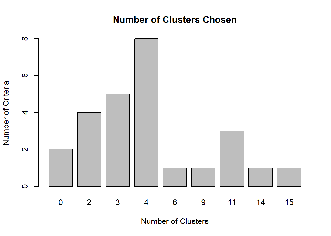
Sum of Squares가 얼마나 줄어드는지 볼 때, 군이 4개일 때가 가장 크게 줄어드는 것으로 확인되었다.
fa.df <- data.frame(fa.df)
km <- kmeans(fa.df, centers= 4, iter.max=100)
library(plotly)
## 필요한 패키지를 로딩중입니다: ggplot2
##
## 다음의 패키지를 부착합니다: 'ggplot2'
## The following objects are masked from 'package:psych':
##
##     %+%, alpha
##
## 다음의 패키지를 부착합니다: 'plotly'
## The following object is masked from 'package:ggplot2':
##
##     last_plot
## The following object is masked from 'package:stats':
##
##     filter
## The following object is masked from 'package:graphics':
##
##     layout

plot_ly(fa.df, x=fa.df[,1],y=fa.df[,2],z=fa.df[,3], size=0.2,color=km$cluster) %>%
  add_markers() %>%
  layout(scene = list(xaxis = list(title = 'Factor1'),
                      yaxis = list(title = 'Factor2'),
                      zaxis = list(title = 'Factor3')))
실제 k-means clustering 결과는 위와 같다. 3개의 Factor를 기준으로 크게 4개의 군이 나뉘는 것을 확인할 수 있다.
각 요인들이 설명하는 변수들은 요인과 변수 사이에 양의 관계에 있음을 위에서 확인했다. Factor1 대인/대물범죄, Factor2 대인범죄, Factor3 인구밀도에 따른 차량절도죄
보라색 - factor3이 높은 그룹(인구밀도와 차량절도율이 높음)
초록색 - factor2이 낮고 factor3이 낮은 그룹(대인범죄와 인구밀도 및 차량절도율도 낮음)
노란색 - factor1이 낮고 factor2가 높은 그룹(대물범죄에 비해 대인범죄가 잦음)
파란색 - factor1이 높고 factor2가 높은 그룹(대물범죄와 대인범죄 모두 높음
k-means 방법 외에도 아웃라이어의 영향을 덜 받는 k-median clustering, 다변량 정규분포이 가정될 때 사용하는 GMM(Gaussian Mixture Model), 밀도기반의 군집분석 등이 있다.